
Segmenting the US with Observation-Weighted K-means Clustering
The setup: using location data to segment regions
At Precisely we build location analytics products based on data from hundreds of millions of devices across the US. Intuitively, we know there is value in breaking down a nationwide dataset to look at regional trends–some of our clients are regional brands; some behavior patterns trend regionally; sometimes we need to account for source data that is skewed geographically. For cases like these, we need smaller geographical units. We have many existing ones to choose from, like states and counties, but those are based on arbitrary political borders that aren’t related to our data. Geographic features like rivers or mountains suggest more natural divisions, but those are also unrelated to human activity. Census blocks are regions designed to contain similar populations, but those only reflect where people live, not where they actually spend their time–working, shopping, recreational activities, etc. This post explores how we defined a new set of geographic regions designed to evenly divide human activity as represented by PlaceIQ location data.
Beginning with data represented as hundreds of millions of individual geographic coordinates, we decided to use a k-means clustering method. Clustering methods are great for finding patterns and groups in data. They’re unsupervised, which means instead of training a model to learn a set of true labels, the optimal grouping emerges from the data points themselves. And these standard techniques can be adapted to a variety of different problems.
The challenge: customizing a clustering solution
Using a clustering method to define our regions presented a couple of obstacles. First, we couldn’t simply cluster the entire set of location pings because there were hundreds of millions and no clustering algorithm would complete in a reasonable time frame. So we pixelated the map and aggregated the number of observations within each discrete area. In other words, we had to transform our data to fit the algorithm. Second, we needed the resulting clusters or segments to reflect the uneven distribution of location data across the space (denoted by the different observation counts in each map pixel), so we had to make sure the algorithm was designed to achieve this result.
Here’s a subset of our data after aggregating it into discrete pixels. Brighter pixels–we nicknamed them gloxels, for globe + pixel–represent areas with more location observations. Predictably, major urban centers are brightest, representing the higher density of human activity in those areas. Our objective then was to find the optimal clustering of gloxels, accounting for the difference in density across the pixels.
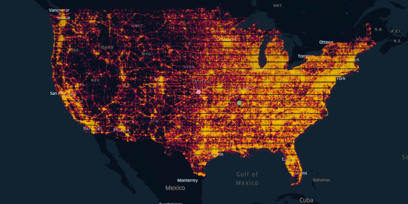
We accomplished this by using a clustering method based on using the weighted centroid–rather than the absolute centroid–of each cluster. The pink and green dots in the map above illustrate the difference between these two concepts. The pink one shows the absolute center, and the green one represents a weighted centroid, like a center of mass, which is pulled toward the more concentrated activity on the east coast relative to the west. This is a trivial solution to our clustering problem, with k=1 cluster and one centroid.
With k>1 clusters, finding the optimal configuration gets more complicated. Ignoring the weights, we’d just have a uniform field of gloxels, and a standard clustering method would yield k equally sized, regularly shaped regions. Instead, we used an observation-weighted k-means clustering algorithm to generate a solution where multiple clusters are represented by weighted centroids, so that once gloxels are assigned to each cluster, the resulting regions reflect the uneven distribution of activity across the map.
Read Product Information
Precisely PlaceIQ Movement
Develop smarter marketing strategies and drive real-world consumer actions by using Precisely PlaceIQ proprietary visitation data to analyze consumer movement, on your own terms.
The technical details
Here’s how it works, in natural language and (pseudo-)code:
Original flavor k-means (with no weights) proceeds in two phases: First, initialization, where a bunch of points–k of them–are chosen (randomly or otherwise) as cluster centroids; each observation (data point) is then assigned to the nearest centroid. Once each point is assigned to a cluster, each centroid is recomputed as the mean of all of its assigned points.
data = gloxel (lat, long)
centers = k initial (lat, long)
assignments = index of assigned center for each gloxel

//assign each point to its nearest center

for each gloxel g {
    distances_1 = distance(g, centers)
    assignments(g) = index of min(distances_1)
    }

//get new cluster centers

for each center c {
    c = mean(g in c)  //the average lat, long
}
Next, the update phase: the centroids have just moved, so each observation is re-evaluated and reassigned, if necessary, to the centroid that’s currently closest to it. [line 19, commented–see explanation below] Whenever an observation is reassigned, the centroids are immediately recalculated to reflect that. The update phase checks every observation, updating its assignment and the cluster centroids as necessary. This phase repeats until no more updates are possible because every point already belongs to the cluster with the nearest centroid.
data = gloxel (lat, long)
centers = k initial (lat, long)
assignments = index of assigned center for each gloxel

//assign each point to its nearest center

for each gloxel g {
    distances_1 = distance(g, centers)
    assignments(g) = index of min(distances_1)
    }

//get new cluster centers

for each center c {
    c = mean(g in c)  //the average lat, long
}
Note: An adjustment to the update phase allows the algorithm to converge in fewer iterations (Sparks, 1973): as each point is evaluated, instead of calculating its current distance from each cluster centroid, we consider what its distance would be if we added it to that cluster and adjusted the centroid to accommodate it [lines 20-28]. Like a good chess player, this method looks one step ahead to determine whether it’s a good move to make, rather than evaluating only the current state of the game. That distance (squared) works out to d2 * (n/n+1) for any cluster the point doesn’t currently belong to. Adding the point to one of these clusters will pull the centroid towards the point, meaning the distance will decrease. It’s d2 * (n/n-1) for the cluster the point does currently belong to, since in that case removing the point will let the centroid drift away, and looking one step ahead, the distance will increase.
(footnote: the algorithm is still somewhat greedy, since it doesn’t take into account what will happen to all the other points if these centroids move, but that was always a limitation of the k-means approach.)
(footnote 2: the factors n/n+1 and n/n-1 are given in Sparks, 1973, and widely accepted–see a MATLAB implementation here; a weighted version here–so we won’t derive them here.)

(K-means update phase–each data point is re-assigned to the cluster whose centroid is closest to it; then the centroid of each cluster is re-calculated as the mean of all the assigned points. Source: https://datasciencelab.wordpress.com/2013/12/12/clustering-with-k-means-in-python/
With weighted k-means, we add two modifications: first, we include the weights in the centroid calculations, so that cluster centroids are pulled toward observations with greater weight [line 17, below]. Accordingly, we make a second change in the update step [lines 27-30, below]. This does the same thing as the unweighted version; it looks ahead to where the centroids would be if we re-assigned the data point under consideration. The calculation changes to account for the fact that the distance that centroid would move depends on the relative weight of the observation. If it’s heavy with respect to the rest of the cluster, it’ll pull the centroid further towards it; if not, it will have less influence.
data = gloxel (lat, long)
weights = number of location observations in gloxel
centers = k initial (lat, long)
assignments = index of assigned center for each gloxel

//assign each point to its nearest center
for each gloxel g {
    distances_1 = distance(g, centers)
    assignments(g) = index of min(distances_1)
    }

//get new cluster centers
numerators = zeros
denominators = zeros
//running total of numerator (weight times data point) and denominator (weight)
for each center c {
    c = sum(g*w for g in c) / sum(w for g in c)//weighted average of g in c
}

update until no more changes are needed:
for each gloxel g {
    For each center c{
        //distance(c) = distance(g, c)
        total_weight = total weight of gloxels assigned to c
        old_center = g’s current center assignment
        if old_center = c {
            distance(c) = distance(g,c) * total_weight/(total_weight - weight(g))
        }
        else {
            distance(c) = distance(g,c) * total_weight/(total_weight + weight(g))
        }
    }
    new_center = index of min(distance)
    if new_center != old_center{
        re-assign g to new_center
        update new_center’s location (weighted average including g)
        update olc_center’s location (weighted average without g)
    }
}
All that’s left is to choose a value for k.
The results
Here are the results for k=20:
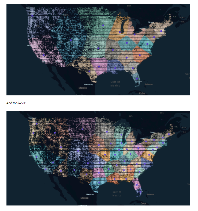
As expected, the result has smaller regions in the Northeast (though not as tiny as some of the actual New England states), and in more dense, urban areas in general. California and Texas are sliced up in more sensible ways than their state borders, considering their size and the amount of data in and around their metro centers.
Conclusion
By taking a clustering approach to creating regional boundaries, we allow our data to drive the process. As a result we get a set of regions whose size and shape reflect the distribution of real human activity. This gives us new insight into our data, as we can see where those optimal boundaries naturally emerge, and offers us the opportunity to do analyses on geographical subsets that are data-driven, rather than pre-existing ones defined by arbitrary political borders.
Compare our result to a similar one from Anderson, who used a weighted clustering method based on the population of each zip code. Notice that the regions we generated here are actually less small in the dense Northeast, a result of the differences in our input data–population clustering reflects only where individuals live, while the PlaceIQ location data shown here represents movement patterns, indicating where people actually go. Our less-concentrated regions indicate that while the Northeast is a region with much higher population density (in terms of where people live), people’s activity in this region (as reflected by location data) is slightly more distributed.
Some of the borders we generated here approximate cultural borders (e.g. the divide between northern and southern California; the separation of West Texas, Houston, and Dallas-Ft. Worth regions) as a natural consequence of where people choose to live. In future projects we’ll explore improving on this result by using the specific devices associated with each gloxel and choosing borders that capture distinct groups of individuals.
Develop smarter marketing strategies and drive real-world consumer actions by using and proprietary visitation data to analyze consumer movement, on your own terms. Read more about our product PlaceIQ Movement.


Build the Context You Need Around Your Data
Chances are, we’ve all heard the story of the lighthouse and the naval vessel, in which the captain of a large ship sees a light in the distance and transmits a command that the smaller vessel...

New Year’s Resolutions and Gym Deals: A Catalyst for Changing Consumer Behavior
Consumers kick-started the year by building more health-focused habits, with nearly a 5% increase in visits to gyms and grocery stores, while interest in less healthy options like convenience stores...

B2B Data Enrichment for Beginners
Your competitors use data to target your customers, discover unmet needs, and explore new markets. If you’re not using data to your advantage, you risk falling behind the rest of the pack. In a...